Need more clicks for your ecommerce store? Trying to boost your conversion rates? Then all you need to do is to find the right call to action.
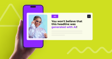
In today’s post, you’re going to discover the best 12 call to action (CTA) examples. We’ll try to show you how to use them and, at the same time, provide you with some diverse copywriting tips to make sure you create the perfect button copy and hit your conversion goals!
Why do we need a well-crafted CTA? It goes without saying – to drive action! So, whether you want more clicks or conversions, you need to use compelling call to action buttons.
With the use of CTA, you can easily check and see if the users you target take action or not.
But before we get started, let’s address some questions.
What is a Call To Action?
A call to action (CTA) is a term used in marketing for any device designed to drive action or sales. A CTA basically is there to tell a user “what to do”. It very often says “Subscribe”, “Click here”, or “Buy now” but there are also long ones like “Check if you are eligible for a discount”.
CTAs are often put in two places:
- On an ad itself in native advertising
- On a landing page, where a visitor was directed to from an ad
Advertisers use them to create a sense of urgency, optimize costs, and increase conversions.
Why Do You Need a Compelling CTA?
The answer is simple: to make sure people click on it! It’s a kind of a “motivator” to proceed with a certain action.
CTAs can also evoke curiosity, address doubts or appeal to a rational part of the brain. Depending on a product type, different approaches may work.
How to find the perfect CTA?
This article provides some examples for you to get inspired, But the best way to find the perfect combination of a CTA, ad, headline and landing page design is to A/B test everything.
Voluum tracker enables automatic or manual A/B tests of landing pages or offers. It uses machine learning to drive most traffic to the winning combination. With it, you can quickly determine which variant resonates best with your audience.
Common problems: Stuck with Low Ad CTR or Landing Page CTR?
To make things even more clear and see how important it is to use a good call to action, let’s dive into two scenarios together.
Scenario 1: Low Ad CTR, Low LP CTR
You are a performance marketer selling tech gadgets. You run native ads, but you are totally lost. You don’t know what ads to create and what landing page CTA works best. You spent some money but people do not click on the ads and your ad CTR is not going to get you any profit.
What to Improve?
Before we get to optimizing your landing page CTR, we need to make sure people actually click on the ad itself. What you need to pay attention to is the ad set. In other words your ads need to get more attention! To increase your ad CTR, test more creatives with different calls to actions.
Repeat until your image / headline combination is meeting or exceeding your ideal impression CTR.
Did it Help?
We’re certain, it did! Now that you have a nice iCTR, let’s move on to Scenario 2.
Scenario 2: High Ad CTR, Low LP CTR
You are a performance marketer selling tech gadgets. You run native ads. You already found your winning ad sets, so you know exactly what headline and what creative to use to ensure a high impression click through rate. Yet you find people losing interest and not clicking on the CTA.
What to Improve?
At this point, we don’t know for sure. It may be CTA or the whole landing page. First, try to craft a better CTA copy. Test different phrases, short ones, long ones and use more powerful angles! Also, make sure a call-to-action button stands out the most on your pages with a high-contrast complementary color and, ideally, a colored background.
Did it Help?
If yes, then you don’t have to redesign your LP content or test different types of landing pages. It was all about the calls to action.
If not, you probably need to find some alternative LPs with different narration and different digital content. Remember, you can test everything with a tracker Voluum!
Best Call To Action Examples
In the following part, you’re going to see real-life CTA examples. We’ll look at different aspects from placements to formatting, but we want to pay extra attention to the language and tone chosen. Take a look and get inspired with us!
Let’s now dive into different types of CTAs:
- Facebook and Instagram Ad CTAs
- Email CTAs
- Landing Page and Website CTAs
- Native Ad CTAs
- Facebook and Instagram CTA Examples
The beauty of social media advertising lies in the in-feed format which merges nicely with the page or app content. The type of ads that prevails on Facebook and Instagram is native.
The following three elements are crucial for native ads:
👉 main image
👉 headline
👉 brand name.
These elements are to lead users to the CTA, so make sure you create a perfect combination of sales copy and imagery. Very often, it is the main image (and sometimes also the headline) that works as a CTA button.
Facebook and Instagram Ad CTAs
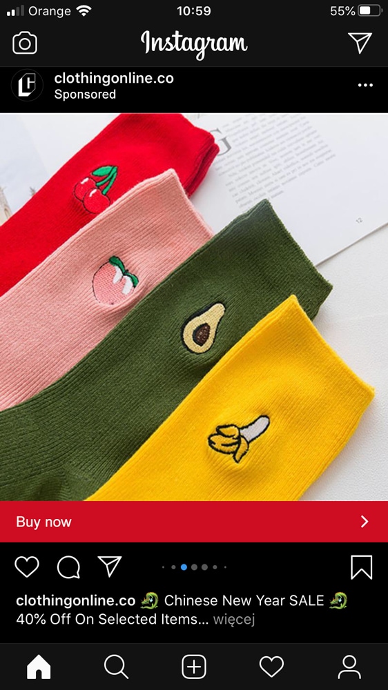
Clothingonline.com
At first, their “Buy now” button appears to be a pretty common CTA, yet combined with the red background and eye-catching colorful image, the simple CTA does the job of enticing buyers to immediately take action.
The message on the CTA is also amplified with a headline that mentions 40% sale.
Source
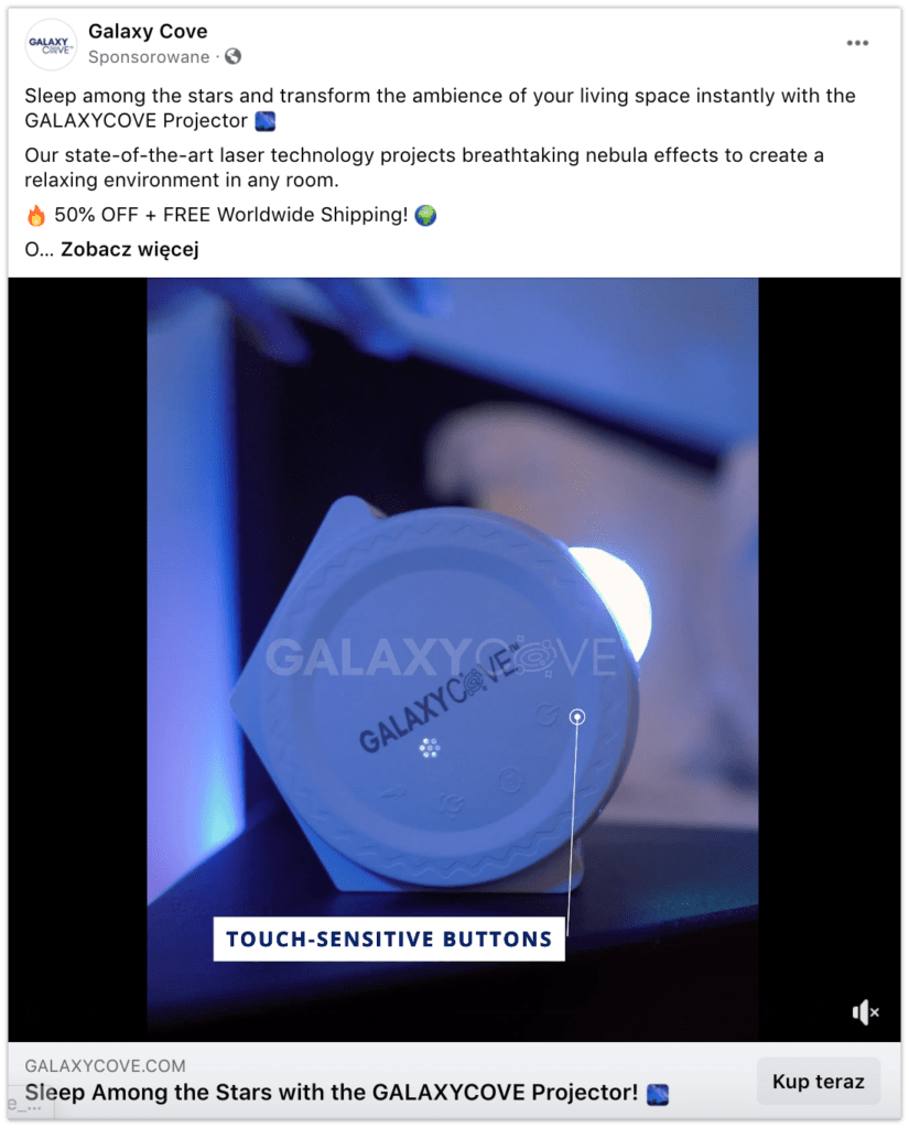
Galaxy Cove
Facebook ads don’t give Advertisers a lot of space (especially when it comes to CTA buttons), so you’d better get straight to the point. With Facebook video ads, users don’t want to give you a whole lot of their attention, all they want is to read brief info before they watch a video.
Galaxy Cove uses a simple Kup teraz (Eng: Buy now) CTA button but the ad is designed to convey a sense of relaxation. The description (actually the very first sentence) includes the primary selling point of their projector: sleeping among the stars.
The video itself captures interest with its soothing colors and some texts appearing one after another.
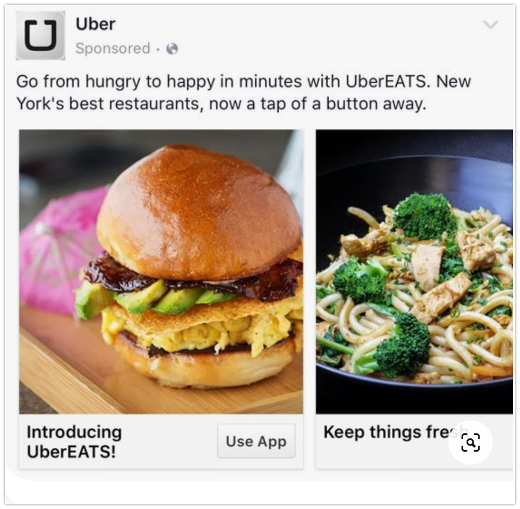
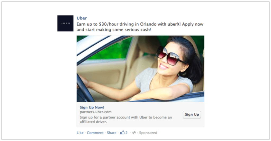
Uber
With their ads targeting both drivers and new riders, no wonder they’ve become one of the largest car services around the globe. They basically soared in popularity without spending millions on testing different CTA buttons and digital ads.
What they do instead is they partner with other brands and businesses offering discounts on food delivery or employing new drivers. Thus the CTAs are really powerful!
Spotify
Sometimes ads can be entertaining and extremely engaging! Would you not agree? Look at the ad below.
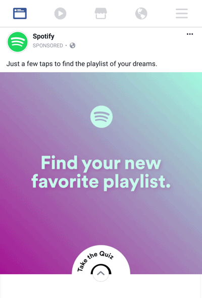
The advertisement above is an example of a video Facebook ad on a mobile device. As you can see, Spotify used a pleasant, colorful video to help their users find their favorite playlist. While a non-Spotify user may see the ad and decide to sign up for Spotify right away, Spotify uses the brand-awareness strategy to create compelling social media content to increase its popularity and functionality.
The CTA located down below the video is pretty fancy in its form yet not aggressive. The message of the call-to-action is “Take the Quiz” which is extremely engaging as people love to participate in quizzes. In this case, it’s not all about the design, it’s all about the “action”.
Making your ads more clickable this way – by using a simple and straightforward CTA button – increases your chances that users will convert. But it goes without saying you need to make sure users see quality content. Always think about the target audience and ask yourself these questions before running your ads on Facebook and Instagram:
How does the audience differ on Facebook and Instagram?
What do people look for on Facebook versus Instagram?
What type and quality of ad would you, yourself, click on?
Email CTAs
Gmail
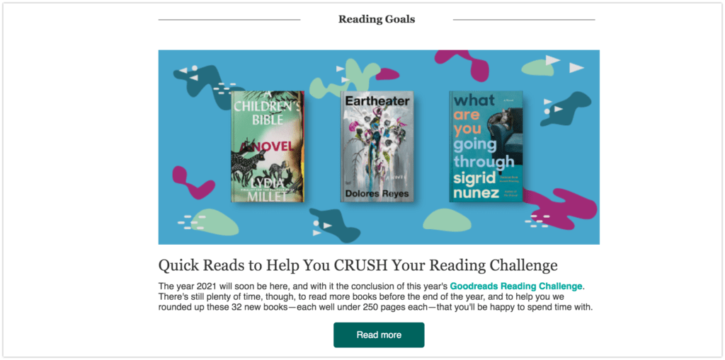
As just mentioned, people love to take part in all sorts of quizzes, hoping they can find out something interesting about themselves and the world around them.
Yet, we humans are not only curious creatures, we are also competitive! We like challenges, we like to compete and… we love to win!
Below you can see an example of an email CTA, again a pretty simple one – “Read more” – yet it’s been enhanced with a description mentioning a reading challenge. The green button does not stand out, it nicely matches the main image colors.
Academia.edu
An American platform for sharing scholarly writing used a custom dynamic CTA to offer a discount on the Premium account. The text in the CTA link is automatically populated with the first name of a targeted user.
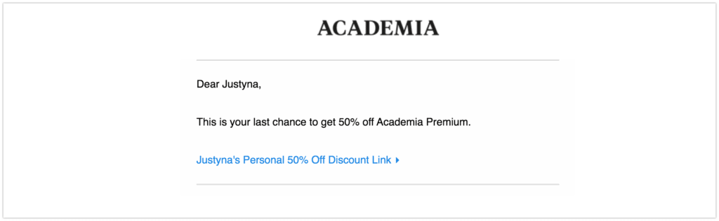
This type of customized CTA includes a username (Justyna) which makes the message even more direct.
Whistle
Whistle, which is a popular GPS solution, uses a few call-to-actions in-mail to encourage pet owners to get tracking for their pet location. The idea is great! Isn’t it?
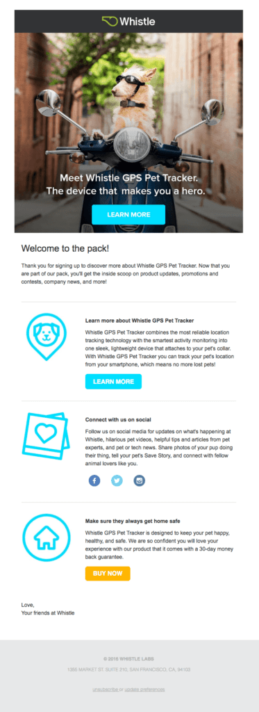
As you see in the example above, the ad has 3 CTA buttons (2 blue ones for a user to find out more about the promoted product and 1 orange button to get users to immediately buy the tracking system).
The image and call-to-action button at the top of the ad stand out. The imagery itself is amusing at the same time conveying the whole idea of pet tracking. The top button offers more information on the solution which works great with products and services that are not yet popular among a wide audience. This non-aggressive and humorous approach ensures that a user gets interested and is left with no other option but to click on the landing page and discover all the benefits of the product.
Before we move on to other examples, we encourage you to subscribe to our blog and leave us a comment! How do you like these ideas for CTAs and which do you think can work best with your campaigns? Also, in the light of the above example,feel free to share with us whether you are a CAT or a DOG person! 🙂
Landing Page and Website CTAs
Landing pages are sometimes called presale pages. Why so? Because these are the pages that encourage potential customers to proceed with a sale. No wonder they are used in performance advertising to boost conversion rate. With a well-crafted pitch, they can bring Advertisers amazing results.
Bloomberg
Bloomberg, a business and finance news provider, uses a CTA message to enhance the idea of saving monthly and annually.
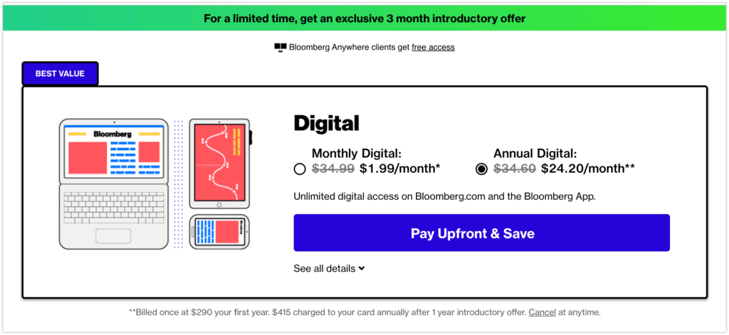
In this great example above, a user can decide between two options. The benefits are described below each option and on the CTA button itself. Contrasted colors are used to catch users’ attention. As opposed to other examples which use image-type creatives, Bloomberg used a graphic-type one showing three device types.
Slack
Slack uses a problem-solution strategy to make prospects aware of a problem and immediately offer a solution. Teamwork, indeed, is not easy especially when communication is limited to online channels.

The CTA button uses an informal language offering clients a free trial of the tool. The imagery has a personal touch with smiling people’s faces.
Aliexpress
A popular e-commerce retail platform, Aliexpress, used an animated GIF that immediately draws your attention to the deals it offers. Needless to say, grabbing a user’s attention with motion increases the likelihood that a person will take action.
VIDEO
When a user clicks on one of the details, the content of the page changes. This interactive CTA makes it clear to visitors that they can buy the listed items.
Tips for building CTAs
Based on the presented examples, we’ve prepared 5 golden rules for creating effective CTAs.
Drive action
Since the main idea of any CTA is to initiate action, make sure the copy is action-oriented. If you’re running an eCom campaign, you may want to use a simple phrase like “Add to cart”. If you want your users to read more about the benefits of your products or services, again, use straightforward language like “Find out more”. Make sure the navigation is clear, follow the rule: the simpler, the better. It makes sense, right?
Say why
FOMO (Fear of Missing Out) is real these days and is definitely something marketers can use to their advantage. We all don’t want to miss out on a good opportunity. That’s why adding an urgency-inducing word to the CTA copy, just like “Subscribe now to Get 50%” or “Join to get $25 back instantly” can work like a charm. Plus, it’s significantly less technical than implementing a countdown timer or a popup.
Be transparent
Users want to know what they can expect after clicking on the CTA button. In fact, including the price of what you’re trying to sell or some benefit a customer will get, can increase credibility and help to build trust. Of course, you don’t have to place such information directly on the button, you can do it just above it. For example, if you’re running an ecommerce store, your text above the “buy now” button could be “30 day money-back guarantee”.
Use a personal touch
Get people to trust you. You can personalize your call-to-action with different techniques. You can implement a dynamically-populated CTA with users’ details (like a name) which is frequently used in email CTAs. Alternatively, make use of problem-solution or question-answer strategies to let your audience know you are aware of their current challenges and you are there to help them. Displaying more than one deal or offer to choose from also does add a personal touch, as there is a little something for everyone!
Choose the right size and color
Yes, color has a huge impact on a user’s behavior and it must NOT be underestimated in the context of digital marketing. Whatever button color you select, make sure it stands out and differs from the text color, but at the same time, does not scream. So, try to find a balance between eye-catching and eye-scratching. Also, it’s widely reported that bold shades of green and blue make good colors for CTAs. Whereas, colors associated with negative emotions like red or black, tend to be less effective. Just keep it in mind.
Make it visible
If your visitors can’t quickly find the CTA button, they probably won’t and you’ll miss out on countless conversions. In fact, ensuring your main CTA is as visible as possible is essential. Remember that there needs to be enough empty space around the button to suggest interactivity. Also, if there is more than one button on a page, you should increase the size of your key CTA and go for a bolder color so that it can stand out from the rest.
A/B test CTAs
This is obvious, but Advertisers sometimes tend to copy their competitors instead of testing new things. A little A/B testing never killed nobody. That’s why you should definitely check multiple variants of your CTA, as it will help you to measure the effectiveness of your call-to-actions.
Let’s Wrap it Up
A compelling call to action is a key part of any successful marketing campaign. It’s the final point of interaction and the last opportunity to convert your visitors. So, whether you’re developing a social media campaign, offering a discount on your product, or promoting a cooking program, you can use effective calls to action to get the job done.
We hope our guide gives you some fresh ideas and inspiration on how to improve your CTAs. Just remember that when it comes to choosing a color for your button, shape, or position, there’s no right or wrong. Only by testing different variations, you can find out what works best for your offer. And for that, you’ll need a reliable, accurate tracker like ours.
Now that you know what it takes to create an irresistible call to action, it’s time to start boosting your site’s conversion rates!
Grab Voluum, design a set of compelling CTAs and see, which one worked